Of course, the first big push came nearly 20 years ago, with ubiquitous Internet access, which ushered in the first websites. Before then, most designers, like me, focused on print, and the arrival of the Internet required us to learn how to design for an interactive medium. The user had become much more than just a spectator.
The transition was harder for some than for others, and that’s why so many websites of the time looked like signs with buttons on them — designers didn’t immediately understand the characteristics of this new medium.
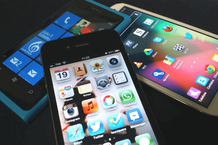
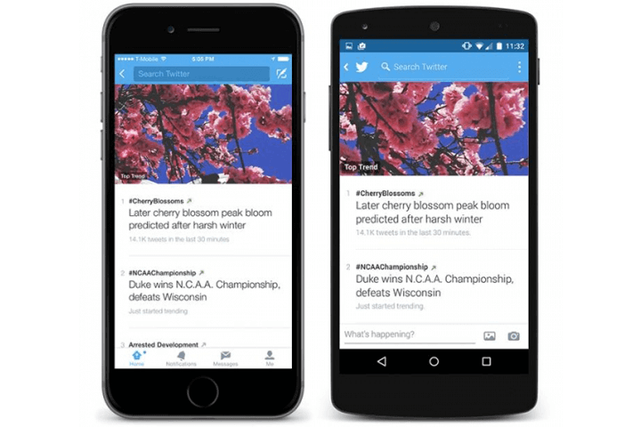
The same thing is happening today with apps. One often comes across applications that look like mini-websites: They’re constructed as web pages “translated” for smartphones, and in turn, they fail with contrast, font size, touch targets and gestures. They also miss the mark with who will be using the app, where and on what devices.
When designing for mobile, escaping from a web structure is imperative because it can work against us. We have to face projects with a different mentality and fully comprehend the mobile devices in order to take full advantage of them and deliver delightful experiences.
So, what do you need in order to be an app designer? Beyond knowledge and tools, you need to change the way you think. Below are a few recommendations for adapting to the world of app design.
Change The Way You Work
Hundreds of apps are entering the market at this very moment — you’ve got no time to lose.
As professionals, we can no longer afford to spend weeks or months on detailed fancy designs before launching a product, only then to realize that other apps have already solved the problem (and most likely solved it in a similar way).
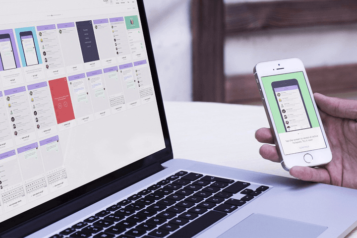
This is where lean UX comes in, a way of working in short quick cycles. The approach entails continual iteration on design and development, keeping one single focus in mind: that nothing is certain until users try it out.
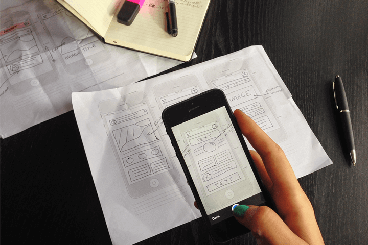
Thus, app design can’t begin with interface design in Photoshop or Illustrator. It has to start before that, with wireframe-based prototypes and basic designs. That way, if change is necessary, it will take moments — not months — to apply.
Beginning with the visual design is a normal tendency for designers: That’s the stage that is usually most interesting to us. In some way, we also got used to working in this way because it was the only way possible.
Recently, in speaking with many designers, most look at me with surprise when I recommend that they start working on projects without even using the computer, but instead by simply drawing on paper. It sounds so natural that we often forget it’s even a possibility. Designing like this has proven to be very useful in preventing us from thinking in terms of variables (such as the size of the design document, colors and fonts used, etc.) — variables and details that can actually block our creativity when we are starting a project.
Personally, I find sketching on paper to be much more useful because we focus only on the idea and the problem to be solved, without falling into the trap of considering design details, or at least not in that first stage.
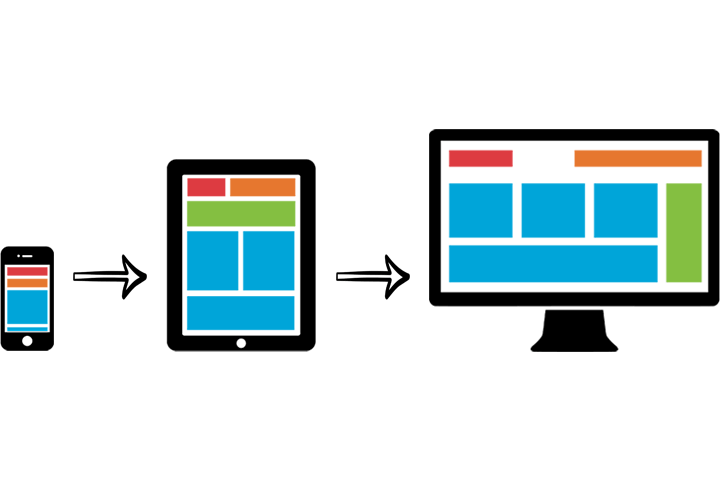
“Mobile first,” or starting with the small screen, is also a good strategy to employ. Even if your app will run on both smartphones and tablets, beginning by designing for the smaller phone is more effective. Starting the design process from a mobile standpoint forces us to prioritize, choose and above all alter our mental structure, which is accustomed to the larger screen of a desktop computer as a general point of departure.
